Dashboard
The dashboard helps in interactive evaluation of experiment results.
Start
The dashboard is started using a Python script:
python dashboard.py -h
usage: dashboard.py [-h] [-r RESULT_FOLDER] [-a] [-u USER] [-p PASSWORD] [-d]

Dashboard for interactive inspection of dbmsbenchmarker results.

optional arguments:
  -h, --help            show this help message and exit
  -r RESULT_FOLDER, --result-folder RESULT_FOLDER
                        Folder storing benchmark result files.
  -a, --anonymize       Anonymize all dbms.
  -u USER, --user USER  User name for auth protected access.
  -p PASSWORD, --password PASSWORD
                        Password for auth protected access.
  -d, --debug           Show debug information.
It has two options:
--result-folder: Path of a local folder containing result folders. This parameter is the same as forbenchmark.py--anonymize: If this flag is set, all DBMS are anonymized following the parameters in their configuration.
When you start the dashboard it is available at localhost:8050.
Select Experiment
You will be shown a list of experiments available at the path you have provided. Select one experiment. Optionally you can activate to have some default panels that will be included at start.
Concept
The dashboard analyzes the data in three dimensions using various aggregation functions:
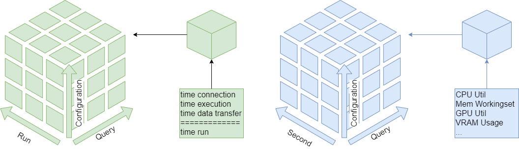
Data
The cells of the runtime cube contain timer (connection, execution, data transfer, run and session) and derived metrics (latencies, throughput). The cells of the monitoring cube contain hardware metrics.
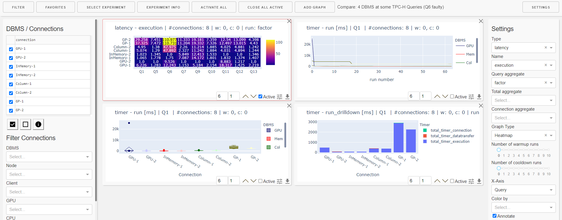
Graph Panels
The dashboard is organized into 12 columns and several rows depending on the screen size. For a single graph panel you can
change width (number of columns)
change height (number of rows)
change ordering on the dashboard
activate settings
download underlying data as csv.
Graph Types
Available types of display are
Line Plot
Boxplot
Histogramm
Bar Chart
Heatmap
Table of Measures
Table of Statistics
These can be applied to sliced / diced / aggregated data of the cubes.
There are also some preset graphs
Heatmap of Errors
Heatmap of Warnings
Heatmap Result Set Size
Heatmap Total Time
Heatmap Latency Run
Heatmap Throughput Run
Heatmap Timer Run Factor
Bar Chart Run drill-down
Bar Chart Ingestion Time
Favorites
The favorites menu allows you to
load a dashboard
append a list of panels to the current dashboard
save the current list of panels as a favorite
download a favorite
upload a favorite
Settings
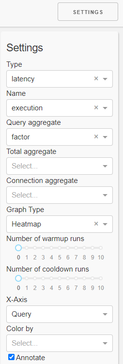
In the settings panel you can select the
Kind of measure you want to inspect (kind, name)
Type of plot (graph type, x-axis, annotate)
Aggregation functions. The order of aggregation is
Query (run dimension)
Total (query dimension)
Connection (configuration dimension)
Aggregation in the connection dimension can be drilled-down (color by)
a number of warmup runs and a number of cooldown runs
This means the first n runs resp. the last n runs are ignored in evaluation.
Note this is only reliable for non-parallel connections.
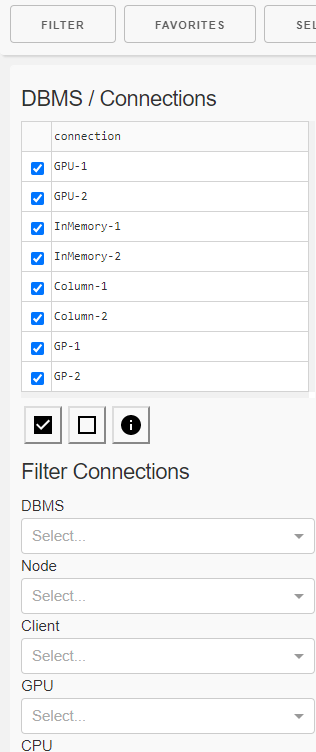
Filter
In the filter panel you can
filter
one or more connections (configurations) using
a checkbox list of single connections
property filters
DBMS
Cluster node
Number of clients
CPU
GPU
single queries
receive details about
the connections (configurations)
DBMS
Resources
and the queries like
Number of runs
Result sets